Verizon Billing Case Study
The ask
For most customers, receiving and paying their monthly bill is the only guaranteed recurring interaction with Verizon. Yet billing and payment issues were historically its largest call driver, generating 12.3 million of 57.5 million annual customer-service calls and an estimated $201 million in yearly support costs.
Customer research showed that many of these calls stemmed from confusion about charges, unclear terminology, and inconsistencies between digital bills. Customers often struggled to understand what they owed, why their balance had changed, and where to find the information they needed.
The project addressed these challenges through three implementation pillars: reorganizing the content hierarchy, creating greater consistency across digital bills, and delivering a more personalized, proactive experience.
The goal was to make billing more transparent and easier to understand by prioritizing essential information, simplifying the layout, and anticipating common customer questions. Customer data and preferences would also be used to provide a more relevant view of each bill, helping customers understand their charges with greater confidence and reducing the need to contact support
The process
As the content strategist on the billing and savings team, my responsibilities were the following:
Established core Billing Principles: Created principles to guide all future work and ensure alignment with Verizon Design's overarching core principles.
Improved content consistency and clarity: Audited and aligned terminology across digital billing experiences to eliminate inconsistencies. Also, simplified verbiage and clarified nomenclature to enhance comprehension.
Built user-centric information architecture: Reorganized the content hierarchy to prioritize the information customers most frequently look for, significantly improving information discovery.
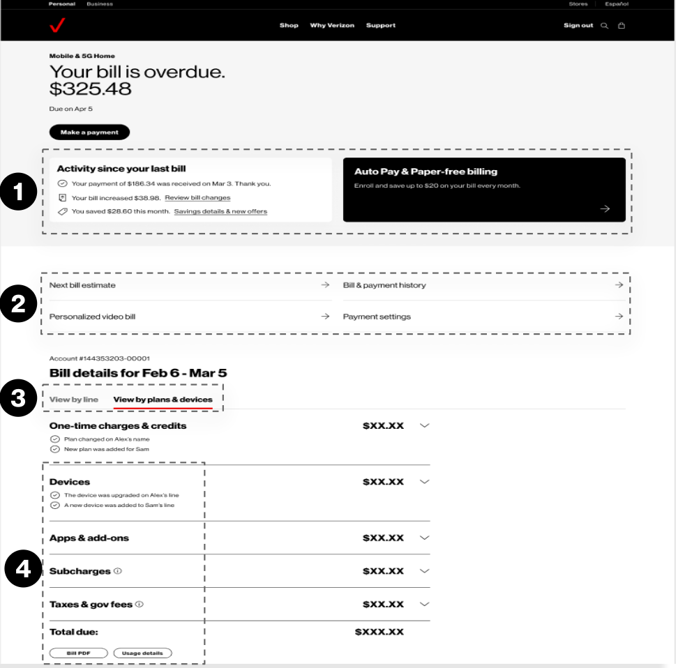
Personalized dashboard tiles: Introduced a new tile-based design featuring personalized highlights for the customer, focusing on the most critical information: payment status, bill changes (increases), and savings opportunities. A secondary tile provided space for important account messages or discount information.
Action-oriented secondary navigation: Developed a secondary navigation component to surface additional possible actions a customer may want to take, improving discoverability of key features.
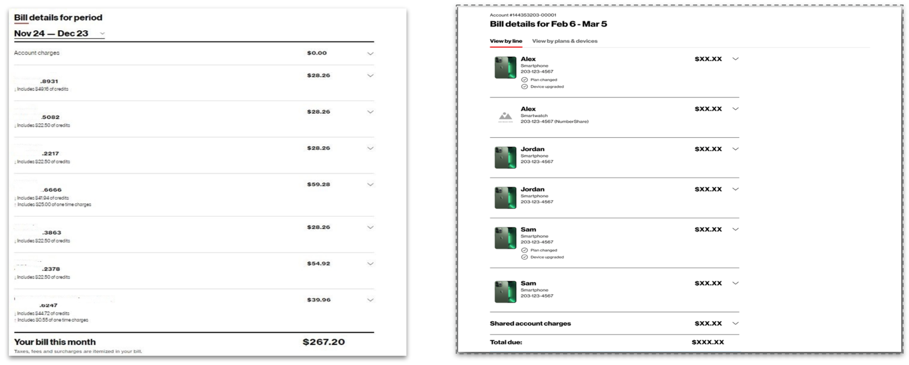
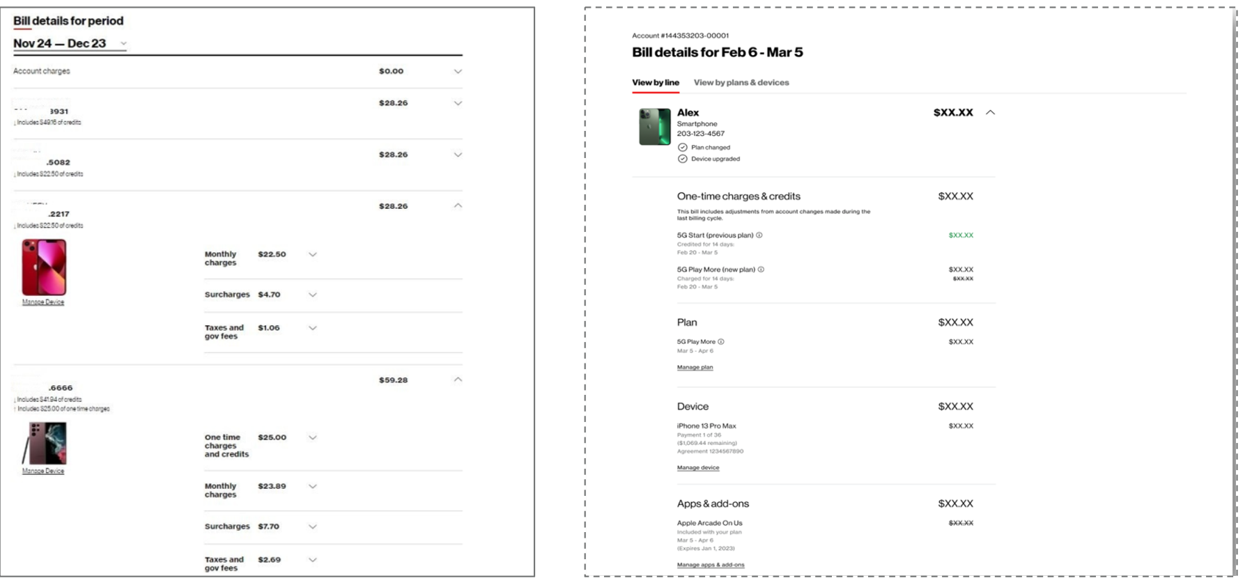
Flexible viewing options: Implemented dual viewing modes, allowing customers to toggle between "View by Line" and "View by Plans & Devices," providing two intuitive methods for reviewing charges.
Updated modular billing structure: Redesigned the core billing structure, separating charges into distinct, intuitive categories. This modular layout utilizes accordions to allow customers to easily drill down for detailed information on specific charges only when needed.
4. Enhanced the navigation: Introduced an improved navigation system that established the main billing page as the central landing hub, enabling customers to easily access all necessary billing information without extensive searching.
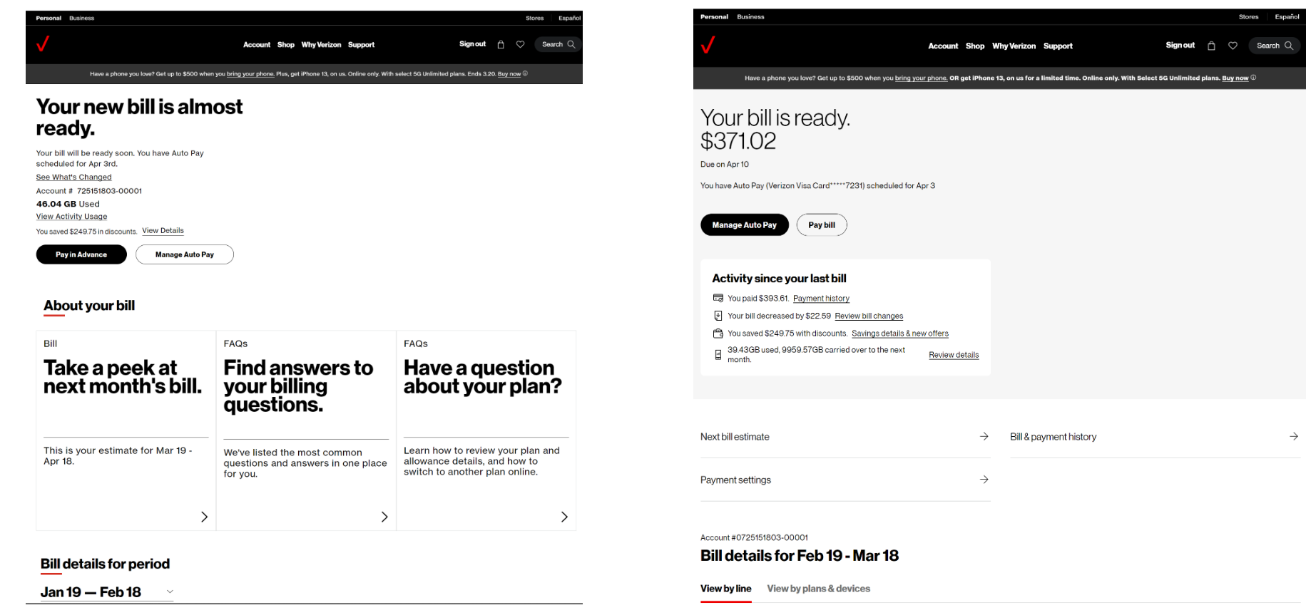
5. Provided personalized highlights with proactive answers: Created a personalized highlight section at the top of the page designed to proactively answer the most frequently asked questions regarding the customer's bill.
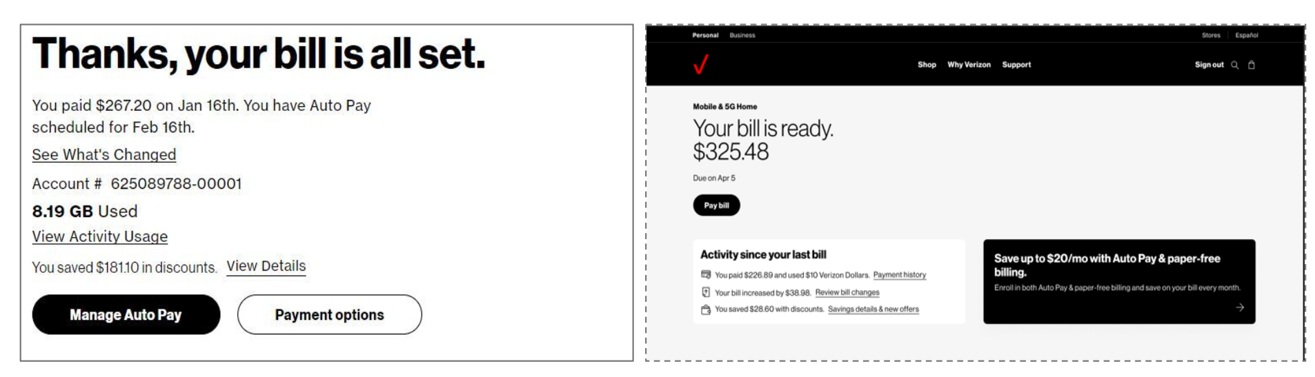
Previous version vs current version
Restructured the content hierarchy to enhance scannability, isolating usage data in a separate section and elevating key highlights into dedicated dashboard tiles.
6. Designed a transparent charge summary: Provided a clear, high-level summary of the monthly total while distinctly separating recurring vs. one-time charges to ensure customers can immediately understand the drivers of any unexpected cost changes.
The challenge
Promotional clarity and consistency: Messaging about promotions and discounts was often incomplete, confusing, or missing altogether. Customers struggled to understand offer eligibility, redemption requirements, and how credits would appear on their bills. These issues were compounded by inconsistent information across digital channels, customer service, and retail locations.
Billing descriptions also relied heavily on back-end codes and internal terminology. I led an audit of promotional and discount labels, developed user-friendly nomenclature recommendations, and tracked their implementation across the billing experience.
Hidden add-on context: Important information about add-on services, promotional periods, and future charges was often difficult to find or understand. Customers did not always realize when a free trial would end or how the service would be billed afterward, leading to unexpected charges and increased risk of bill shock.
Trade-in flow confusion: Customers often perceived the trade-in process as unnecessarily complex. Unclear pathways, duplicated steps, and broken or disconnected experiences made it difficult to understand eligibility, complete a trade-in, and receive the expected promotional credits.
Results and Impact
The redesigned billing experience improved customers’ understanding of their bills while delivering measurable reductions in support costs and call volume.
Improved customer comprehension and confidence
Qualitative research showed that customers found the redesigned bill clearer, simpler, and easier to navigate despite the inherent complexity of utility billing. Participants reported greater confidence in the total amount due and were able to identify important account changes more quickly.
The “Activity Since Your Last Bill” feature was particularly well received, with customers describing it as useful and valuable. Participants also praised the revised information architecture, which allowed them to move easily from a high-level summary into more detailed information.
Updated terminology further improved comprehension by making distinctions between recurring and one-time charges, as well as partial-month and prorated charges, easier to understand.
Measurable business impact
2024 billing redesign
The redesigned billing experience launched to all users on Oct 7, 2024. Clearer explanations of Auto Pay discounts, prorated monthly charges, and total monthly savings contributed to:
225,900 fewer customer-service calls
$3.8 million in expense savings
2025 receipt redesign
Building on the billing redesign, a new modular receipt experience launched on Feb 8, 2025. The updated format made payment information clearer, more scannable, and easier to understand.
During the full measurement period, the receipt redesign contributed to:
118,000 fewer customer-service calls
$259,000 in expense savings
Together, these initiatives demonstrated how clearer content, more intuitive information architecture, and proactive explanations could improve customer confidence while reducing avoidable support interactions and operational costs.